https://falx.cs.washington.edu

Modern visualization tools aim to let data analysts easily create exploratory visualizations. When the input data layout conforms to the visualization design, we can easily specify visualizations by mapping data columns to visual properties of the design. However, when there is a mismatch between data layout and the design, we need considerable effort on data transformation.
But, if I am a novice data scientist without much programming experience, how can I create expressive visualizations?
Falx is a visualization-by-example tool to address this challenge. Falx lets users demonstrate how a few data points should be visualized, and it automatically generalizes it into programs that can visualize the full dataset. With this, even novice users can easily create expressive visualizations because they don’t need to worry about data transformation.
This blog post introduces visualization-by-example in Falx. The Falx online editor is available at https://falx.cs.washington.edu. More system details are available in our CHI 2021 research paper and our POPL 2020 research paper.
The Challenge: Data Transformation
With modern visualization tools like Tableau, ggplot2 or Vega-Lite, we can create visualizations easily using mappings from data columns to visual properties, thanks to the design from the grammar of graphics [1].
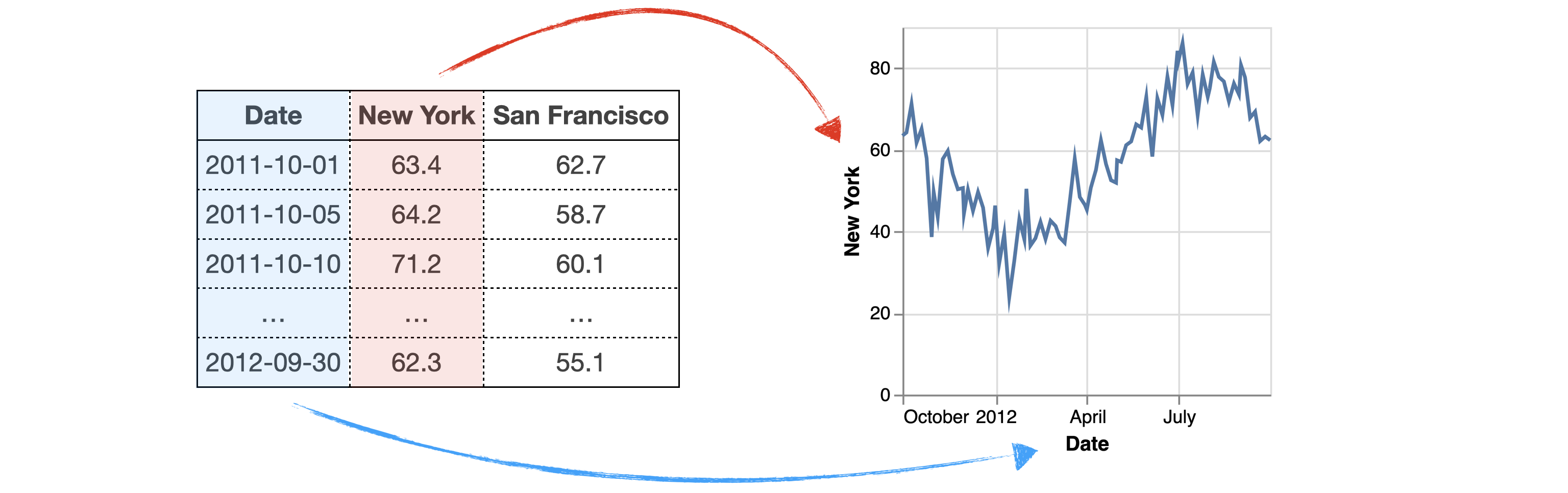
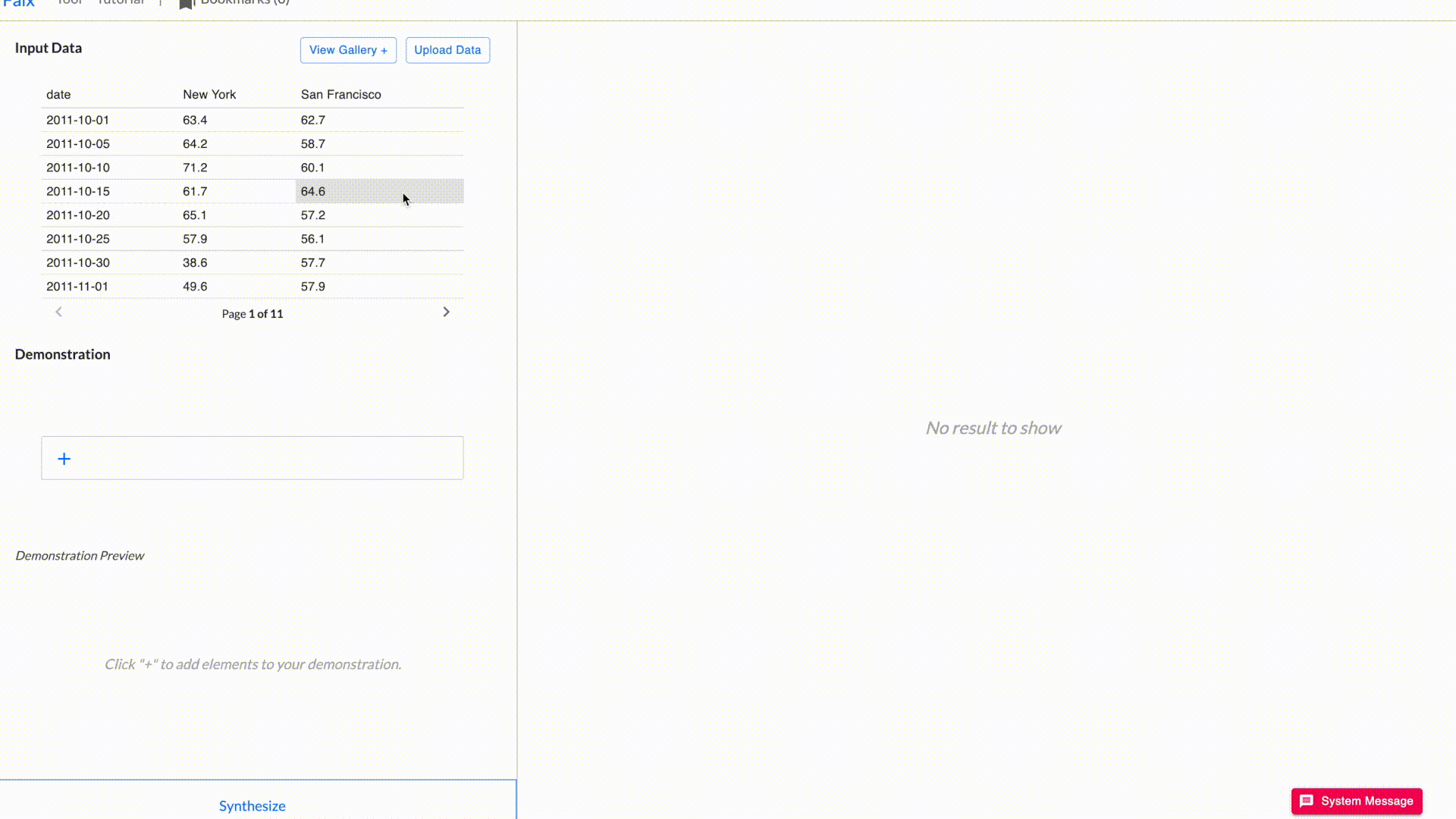
For example, the following is a dataset of San Francisco and New York temperatures between 10-01-2011 and 10-01-2012. If we want to visualize New York temperature trends, we can easily create a line chart using a simple mapping {Date → x, New York → y}.

However, when there is a mismatch between data layout and the visualization design, we can’t do it easily in the same way. We need to spend considerable efforts on data transformation and visualization scripting.
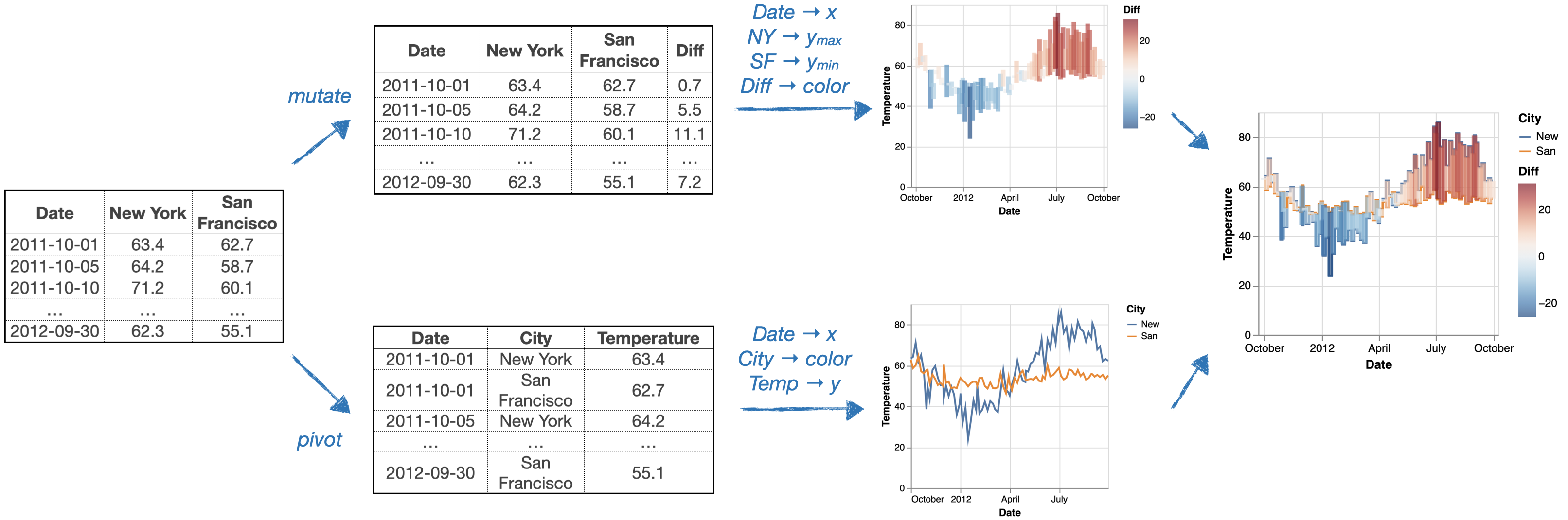
For example, if we want to create the following visualization to compare New York and San Francisco temperatures (using a line chart for temperature trends and a bar chart on top to show differences), we need much more work.

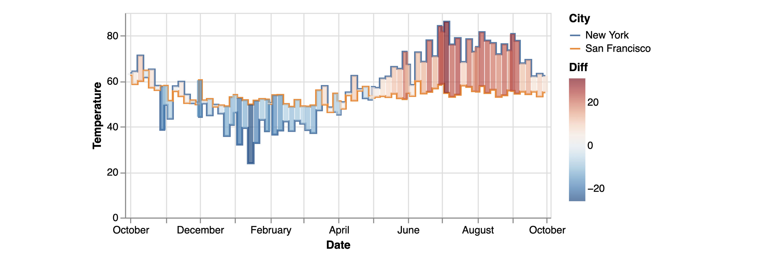
Concretely, we need to: mutate the input data to calculate the temperature differences map it to a floating bar chart, pivot the table and map it to a colored line chart, and finally combine the two layers together.

As you can see, this process can be time consuming and requires users to be familiar with both data transformation and visualization libraries. As a result, novice users find it challenging (and sometimes impossible) to create a complex visualization and expert users are tired of transforming data again and again throughout the exploratory data analysis process.
This raises a question: can we design a new way to specify visualizations so that users don’t need to worry about input data layouts?
The Solution: Visualization by Example
Falx is a visualization-by-example tool to bypass these challenges. In Falx, we use a few data points from the dataset as an example to demonstrate how they should be mapped to the canvas, and Falx automatically generalizes the example to visualize the full dataset.
For example, in order to create the visualization to show the difference between New York and San Francisco temperature in Falx, instead of spending effort on data transformation or visualization scripting, we only need to create a small example to demonstrate our design. Here, we only need to:
- create an example line segment that shows San Francisco temperatures on the first two days (the segment starts at x1=2011–10–01, y1=62.7, ends at x2=2011–10–05, y2=58.7, and it is colored as “San Francisco”);
- create an example bar to show temperature difference between the two cities on the first day (the bar is at x=2011–10–01, starts and ends at y1=62.7, y2=63.4, and it is colored with the difference 0.7);

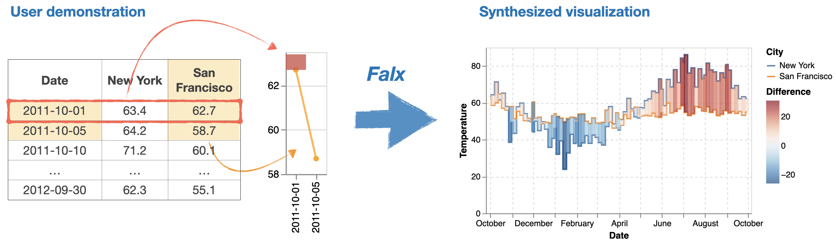
This small example is a demonstration of our visualization design. Falx uses it to synthesize a pair of data transformation and visualization programs to visualize the full dataset. Here, Falx generalizes the line segment into a line chart to show temperatures of both cities on all dates, and generalizes the bar to show temperature differences between the two cities on all days.
Here is how it looks like when creating the visualization in Falx — we can easily create an expressive visualization using simple drag-and-drop.

You can try Falx on our own here: https://falx.cs.washington.edu.
The Technique: Program Synthesis
Falx is powered by a technique called program synthesis: starting from the user example, Falx will search for programs defined by the data transformation language (R tidyverse) and the visualization language (Vega-Lite) that satisfies the user example (i.e., the visualization outputted from the program should contain all elements from the user example).
Here is a brief overview of the synthesis algorithm, Falx will:
- decompile the visualization provided by the user into a visualization program and an intermediate data (the small data behind the example);
- search for data transformation programs: these programs are essentially tidyverse scripts that can transform the input to match the intermediate data generated in step 1;
- generate final scripts by combining data transformation and visualization programs and render the visualizations for user exploration.

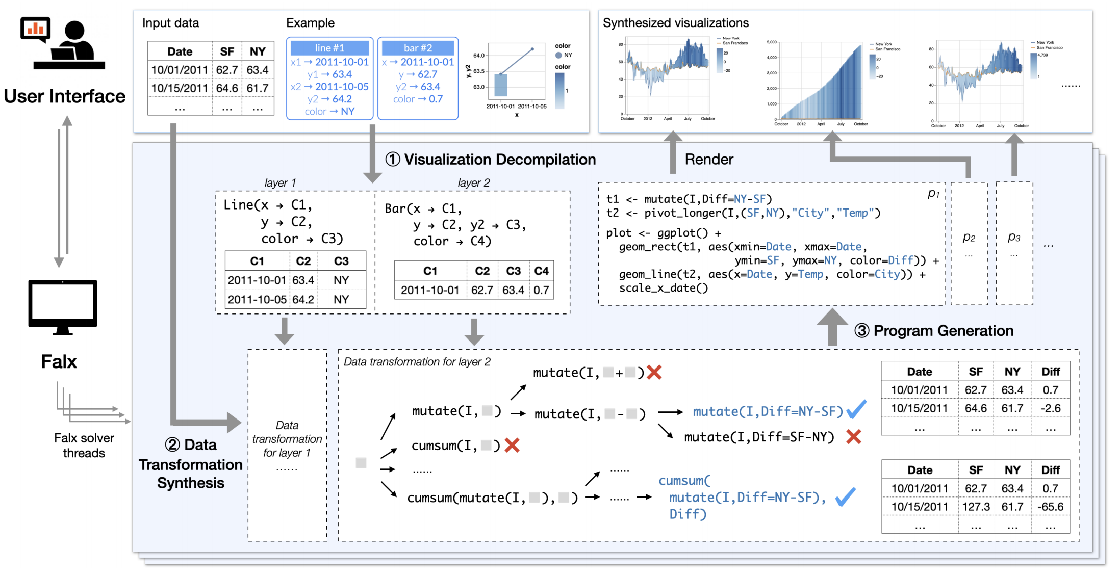
Since the program synthesis task involves a challenging combinatorial search process (step 2) that can be prohibitively expensive, Falx adopts a technique named abstract interpretation to enable efficient search. Concretely, during the search process, Falx analyzes behaviors of partial programs to decide if they can lead to desired programs, and it prunes out infeasible programs to avoid futile search in these sub program spaces. You can read more about our technique from our research paper “Visualization by Example” (POPL 2020).
With this design, Falx can efficiently solve practical visualization tasks: when tested on visualization problems posted on Stack Overflow and online tutorials, Falx can solve most of them with in 20 seconds.
Summary & Future of Falx
Falx is a visualization-by-example tool that can synthesize data visualization from examples. Since Falx bypasses the data transformation and the visualization scripting challenges, non-experienced users can use Falx to create expressive visualizations that they cannot easily create otherwise. We hope Falx provides one exemplar for how to adapt core techniques in synthesis into powerful interactive tools that empower human creativity.
On the application side, we are working on data layout-flexible visualization exploration techniques to allow users to explore new dataset flexibly without being constrained by its current layout. We also aim to build Falx around programming notebooks so that can experienced data scientists to do “program drafting”, i.e., creating visualization program drafts from Falx to bootstrap the analysis process.
On the technical side, we are building interactive synthesis algorithms that let Falx evolve adaptively as user interact with Falx. We hope Falx can more fluently interact with users (both explaining how it solves the problem and what helps it need from users) so that Falx and user can collaboratively work towards more complex tasks together.
Further Reading
To learn more about Falx, you can refer to the following research papers:
- Falx: Synthesis-Powered Visualization Authoring (CHI 2021, best paper award) to learn more about the interactive system design
- Visualization by Example (POPL 2020) to learn about the core algorithm
To play with Falx, visit our online editor at https://falx.cs.washington.edu/. There, you can explore our gallery, visit the tutorials, and actually use it to create data visualizations of your own dataset!
Falx project page: https://falx.cs.washington.edu/
This article is authored by Chenglong Wang, and the team behind Falx includes Chenglong Wang, Yu Feng, Ras Bodik, Isil Dillig, Alvin Cheung and Amy Ko.